Creating UX Consistency for Faster Product Teams
UX Research & Systems Case Study
problem statement
Monorail’s rapid iteration created UX inconsistency, slow handoffs, and design debt. I audited patterns and helped shape a Flutter-ready system that improved clarity and team delivery speed.
Objectives
- Audit inconsistent UI patterns across the app
- Identify design debt that slowed product and engineering workflows
- Improve handoff clarity between design and development
- Standardize foundations for typography, color, spacing, and components
- Support faster product delivery with a system that could scale
Goals
- Create a Flutter-ready design system that engineers could implement cleanly
- Reduce repeated one-off design decisions
- Improve consistency across existing and future screens
- Make light and dark mode easier to manage
- Give product, design, and engineering teams a shared source of truth
my process
From Design Debt to Scalable UX Consistency

Audit Product Friction
I reviewed existing screens, patterns, spacing, hierarchy, and component usage to identify where inconsistency created user and team friction.

Define System Foundations
I helped shape reusable foundations for tokens, components, variants, and light/dark mode behavior that could translate cleanly into Flutter.

Rebuild and Validate
I supported screen rebuilds using the system to test whether the new patterns improved clarity, consistency, and implementation readiness.
Qualitative Research & Ideation
We audited product screens, reviewed design system precedents, mapped handoff issues, collaborated with engineers, and synthesized patterns into a scalable product system.
Key Observations
- UI inconsistencies across screens increased cognitive load and made the product feel less cohesive.
- One-off styling slowed design and engineering handoffs.
- Manual light and dark mode overrides made consistency harder to maintain.
- Similar screens were being rebuilt repeatedly instead of using reusable patterns.
- Handoff gaps created unnecessary interpretation work for engineering.
Inferences
- A token-based system would reduce both design debt and maintenance overhead.
- Clear component rules would improve engineering velocity.
- Theme-driven light and dark modes would scale better than manual overrides.
- Reusable patterns would let the team move faster without sacrificing UX quality.
- The system needed to reflect real implementation constraints, not just visual ideals.
RESEARCH FINDINGS
Defining User Needs

System Consistency
Teams needed consistent spacing, typography, hierarchy, colors, and components across the full product experience.

Engineering Clarity
Engineers needed clear component variants and token mappings that translated cleanly into Flutter.

Design Efficiency
Designers needed faster workflows without repeatedly redefining styles or rebuilding similar screens.

Scalability Confidence
The system needed to support new features without creating more design debt or implementation confusion.
Recommendations Turned Into Product Decisions
To support the findings, the design system was structured around consistency, implementation clarity, and long-term scalability.
Token System
Centralized color, spacing, typography, and radius tokens created a consistent foundation for future product work.
Light/Dark Modes
Theme tokens made it easier to support light and dark mode without manually overriding every component.
Component Library
Reusable buttons, cards, layouts, inputs, and controls replaced one-off patterns with scalable building blocks.
Flutter Mapping
Component states and variants were structured around real engineering needs, reducing ambiguity during implementation.
Screen Rebuilds
Existing screens were rebuilt using the system to eliminate legacy inconsistencies and improve visual hierarchy.
UX Refinements
Spacing, alignment, hierarchy, and readability improvements made the product easier to scan and understand.
Components
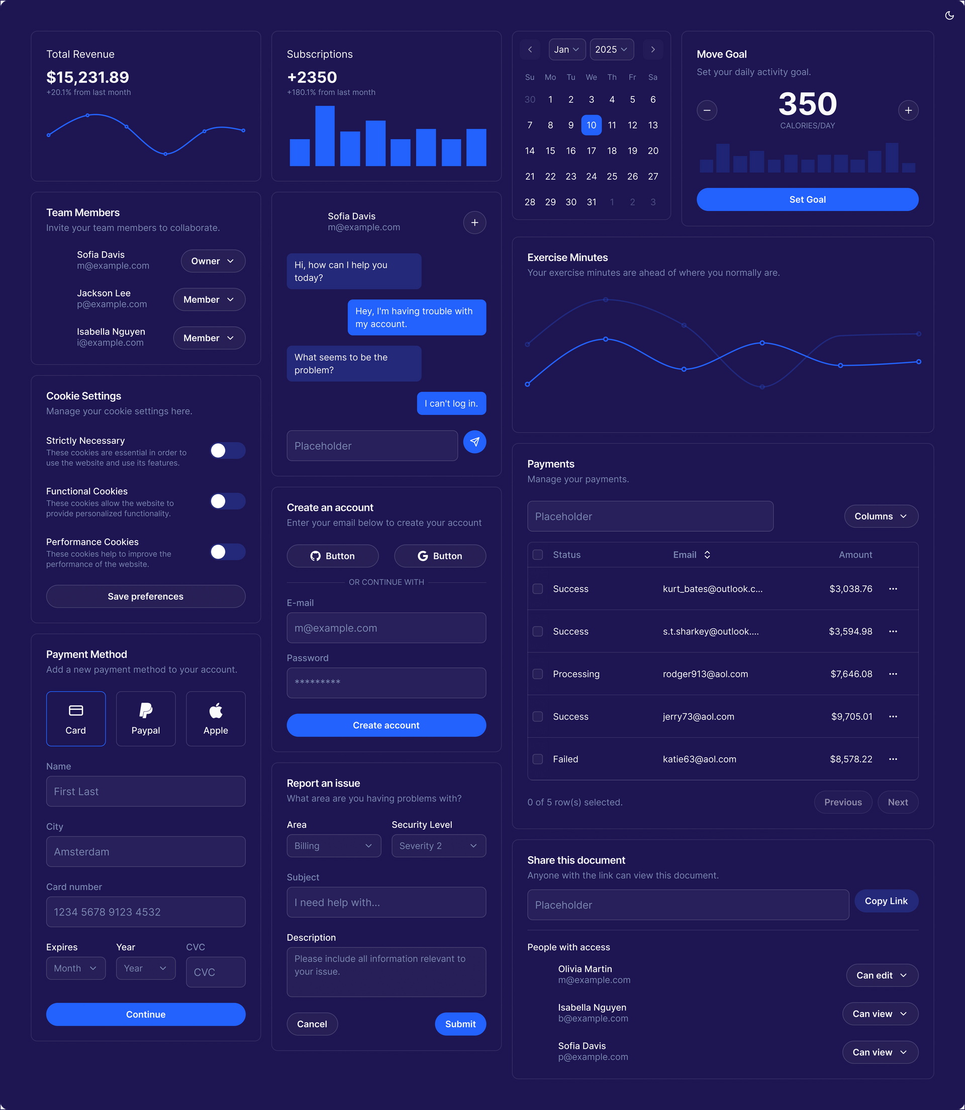
High Fidelity Screens

The user’s home screen after account creation, rebuilt with clearer hierarchy and consistent components.
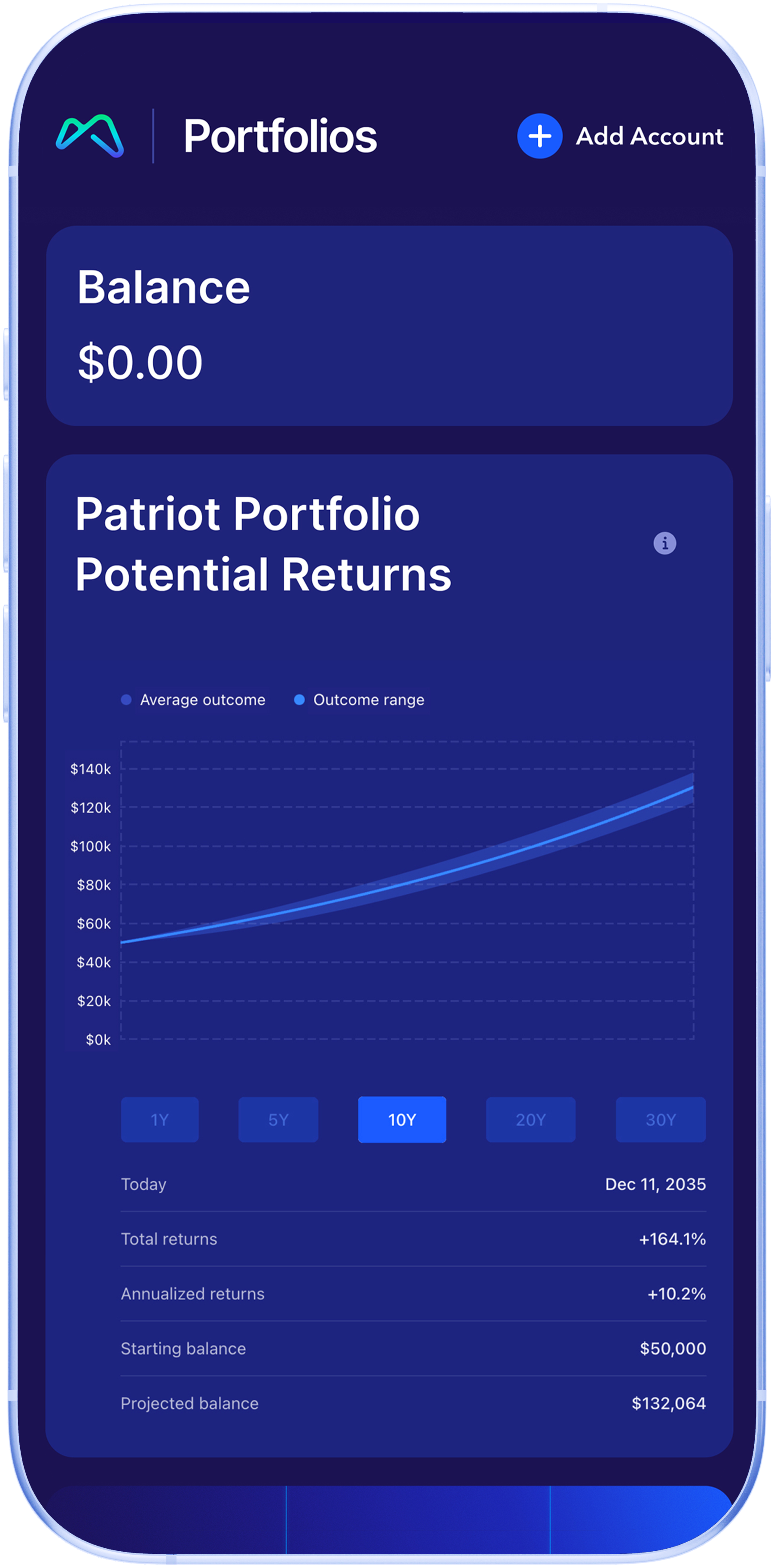
The portfolio screen before activation, using a clearer empty state and next-step path.

The home screen after portfolio activation, showing account status and portfolio activity with more consistent patterns.

The stocks screen before trading account creation, with improved hierarchy and action clarity.

The trading account experience using standardized cards, buttons, and layout patterns.
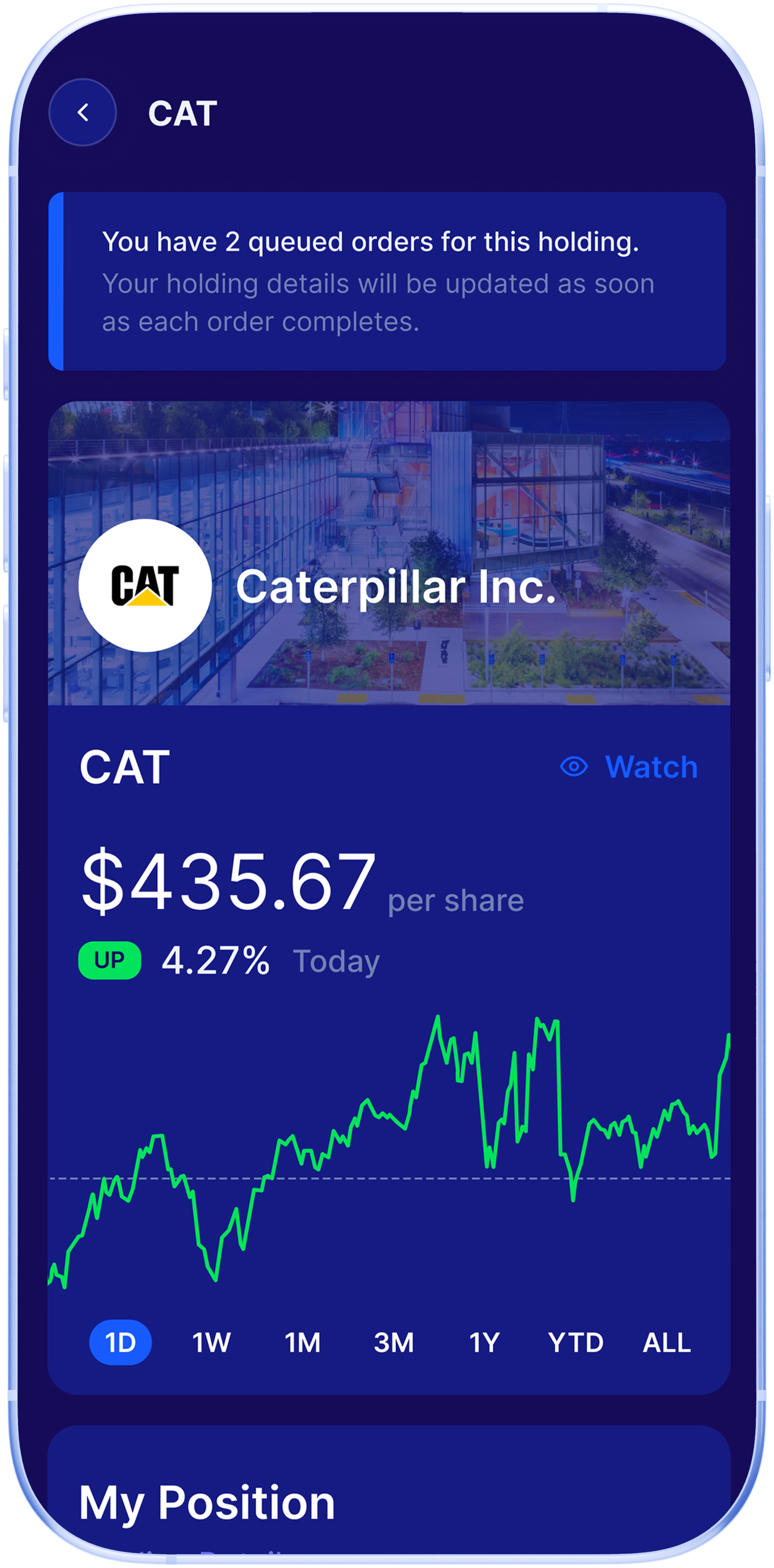
A stock detail screen with improved spacing, readability, and reusable content structure.
outcome
The system helped turn scattered product patterns into a clearer foundation for faster, more consistent product delivery.
By auditing UX friction, reducing design inconsistency, and defining Flutter-ready patterns, the team created a system that improved design speed, engineering clarity, and product cohesion.
The work gave Monorail a more scalable foundation for future features while reducing the amount of repeated design and implementation work required to ship.
Most importantly, the product began to feel more consistent, trustworthy, and easier to build on.
Let’s talk about your project
Fill in the form or call to set up a meeting at (315) 530-5269 or email me at gregorylifanov@gmail.com